I've written before about the new fabric printing service, Spoonflower, and how much fun it's generating. Up until last month you could only order fabric designs you'd uploaded yourself, and selling your fabric involved ordering it and offering it at eBay, Etsy, or the like. Then, when they began their Beta Marketplace I jumped on the chance to order some fabric designs I'd been eyeing. All my orders have now come in and I have to say that I'm thrilled!
The first order was Amor de Los Muertos, by Lisa Jonte (Arcana-j). I just love how clean and fun this pattern is.
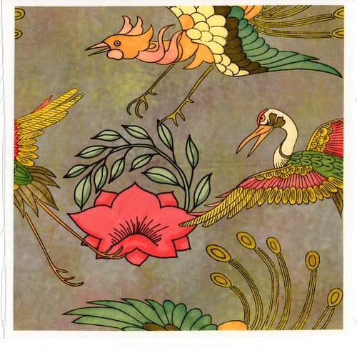
My second order included some coordinating fabric for Amor, as well as Victoria Lasher's Raining Hedgehogs, with a coordinating pocket design. To round off the order, I got an 8 x 8 in sample printed of my Japanese Mon design I created using three Dover patterns.

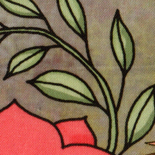
Unlike their designs with plain backgrounds, mine had a lot of texture and color, so I was curious to see how it would come out. I have an ancient CRT monitor that isn't calibrated in any way, so what I see on the screen is a real crapshoot vs. what I might see on a calibrated monitor. If I do more of this I may have to invest in a new one! Having received the sample, I have to say that I am pleased with the brightness of the colors, as well as the crispness of the detail. One thing that helped a great deal was saving the Photoshop file in RGB mode, then CMYK, before finalizing in LAB for the Spoonflower upload. This effectively removed all the out-of-gamut colors with minimal effort. Shifting out-of-gamut colors are what surprised a lot of early designers Spoonflower when they got their first samples back.
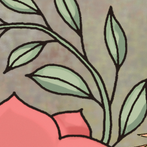
Looking first at a 2 x 2 in area of the design that I colored myself (it was originally just an outline), you can see that the fabric texture darkened the design a small amount, and the colors are richer (at least from what I can see! LOL!). The medium tone on the flower and leaves essentially disappeared, and the background pattern is much more textured and vibrant.
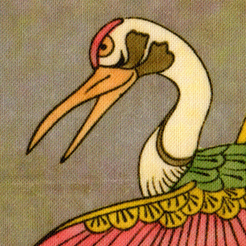
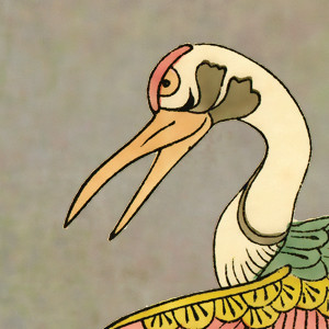
The crane closeup shows part of the design that was originally a scan of a Japanese woodblock print, and I multiplied the colors in Photoshop. The sample shown is also a 2 x 2 in square and the design was printed on off-white quilting cotton. The golds were a bit darker than I was expecting, so I'll lighten that up for the next try.
I really like how the background texture works on this design, but now I want to take the three individual units and rearrange them so the repeat is a bit nicer, as well as design a pillow front. I've already created several coordinating two-color 1/2 in stripes that can also be presented as checks, giving a lot of variations to play with, and will follow with just the background texture, which should make a nice backing for the pillow, or even a coordinating pillow front. Once that's done, I'll have a full suite of custom coordinated fabrics guaranteed to work together. Schweet!

No comments:
Post a Comment